Judit gets stupidly excited when she realized that the gallery at which the art history lecture they were at was also exhibiting works by her favourite New Zealand artist.
 The Abstract Art of Milan Mrkusich
Now, I know abstract art is not everyone's cup of tea but I personally love it. From the very first time my art history teacher last year presented us with an abstract work and told us to analyze it, I was hooked. I believe that very work was The Deep by iconic American Abstract Expressionist, Jackson Pollock. I love finding meaning beyond any recognizable subject matter in the shapes, colours, texture and scale of the work and how all these element interrellate to create coherency and meaning. Held at the Gus Fisher Gallery as part of the Auckland Festival, this particular exhibition aimed to "[provide] a unique opportunity to study first-hand the deployment of symbolic form, line and colour in Mrkusich's painting over four decades."
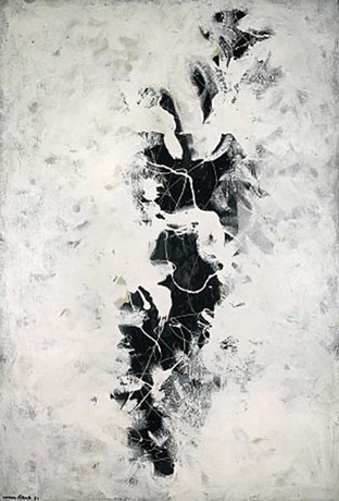
Image: Chromatic Meta-Grey No. 2
 Ryan and I gravitated around the gallery, stopping to engage with and analyse each work. Though I'd studied Mrkusich quite a bit last year, I had not studied any of these particular works though I recognised some of the series' they were from. Painting Ochre was from a series I recognized with the corners of the work containing it. Like many abstract works, they are large scale pieces you have to encounter face to face to get the full impact. What looks like just a simple coloured field with a coloured corners, was in fact a turbulent mass of texture which writhes in front of your eyes while the solid coloured corners seemed to struggle to contain it within the confines of the canvas. All the works provoked similar responses where flat colour competed against thick texture, circles contrasted crisp lines and edges, bright primary colours interplayed in large expanses, squares, lines and rectangles to lead the eye around a certain way, all in a constant mood of movement and turbulence.
Each work we discussed in terms of how these elements interplayed and what feelings these reltationships evoked. Mrkusich's works can be compared to the likes of another iconic American artist, colour field painter Mark Rothko whose large scale canvases contained large washes of colour with floating and pulsating rectangles and squares. The purpose of these works is to set up a space for the viewer to stand in front of and mediate, relflecting upon the emotions evoked by the colours to create a very personal repsonse based on what each individual brings to the work and such an effect was the same when we encountered Mrkusich's works. By removal of any recognisable figure or even a title, the viewer is forced to bring their own meaning to the work and that is why I love absract art.
I was thrilled to see this exhibition as it was the first time I saw his works, previously only learning from small colour reproductions which hugely reduce the impact. I always find it unfortunate that people approach abstract art with a very narrow mind and the attitude of 'oh, I could've done that.' Perhaps that is true that anyone can grab a canvas, fling paint at it and call it abstract art but the purpose of that is in fact only to fling paint at a canvas. Where the incentive to create and evoke drives the creation, that is what I feel justifies abstract art.
Coming up in Part 3: Ryan and Judit wander across town on foot to Newmarket...tune in next installment to see what hilarity ensues. May contain traces of Lego and geese.
 The Abstract Art of Milan Mrkusich
Now, I know abstract art is not everyone's cup of tea but I personally love it. From the very first time my art history teacher last year presented us with an abstract work and told us to analyze it, I was hooked. I believe that very work was The Deep by iconic American Abstract Expressionist, Jackson Pollock. I love finding meaning beyond any recognizable subject matter in the shapes, colours, texture and scale of the work and how all these element interrellate to create coherency and meaning. Held at the Gus Fisher Gallery as part of the Auckland Festival, this particular exhibition aimed to "[provide] a unique opportunity to study first-hand the deployment of symbolic form, line and colour in Mrkusich's painting over four decades."
Image: Chromatic Meta-Grey No. 2
Ryan and I gravitated around the gallery, stopping to engage with and analyse each work. Though I'd studied Mrkusich quite a bit last year, I had not studied any of these particular works though I recognised some of the series' they were from. Painting Ochre was from a series I recognized with the corners of the work containing it. Like many abstract works, they are large scale pieces you have to encounter face to face to get the full impact. What looks like just a simple coloured field with a coloured corners, was in fact a turbulent mass of texture which writhes in front of your eyes while the solid coloured corners seemed to struggle to contain it within the confines of the canvas. All the works provoked similar responses where flat colour competed against thick texture, circles contrasted crisp lines and edges, bright primary colours interplayed in large expanses, squares, lines and rectangles to lead the eye around a certain way, all in a constant mood of movement and turbulence.Each work we discussed in terms of how these elements interplayed and what feelings these reltationships evoked. Mrkusich's works can be compared to the likes of another iconic American artist, colour field painter Mark Rothko whose large scale canvases contained large washes of colour with floating and pulsating rectangles and squares. The purpose of these works is to set up a space for the viewer to stand in front of and mediate, relflecting upon the emotions evoked by the colours to create a very personal repsonse based on what each individual brings to the work and such an effect was the same when we encountered Mrkusich's works. By removal of any recognisable figure or even a title, the viewer is forced to bring their own meaning to the work and that is why I love absract art.
I was thrilled to see this exhibition as it was the first time I saw his works, previously only learning from small colour reproductions which hugely reduce the impact. I always find it unfortunate that people approach abstract art with a very narrow mind and the attitude of 'oh, I could've done that.' Perhaps that is true that anyone can grab a canvas, fling paint at it and call it abstract art but the purpose of that is in fact only to fling paint at a canvas. Where the incentive to create and evoke drives the creation, that is what I feel justifies abstract art.
Coming up in Part 3: Ryan and Judit wander across town on foot to Newmarket...tune in next installment to see what hilarity ensues. May contain traces of Lego and geese.
No comments:
Post a Comment