Sunday, May 3, 2009

$12 million for what?


Managed to nab free tickets to the Auckland Art Fair originally worth something like $45 so it was little wonder that at that price and on a Friday night, Ryan and myself were definitely among the youngest there. We were also definitely a little under dressed in our everyday uni garb, surrounded by people in full on suit and tie garb, drinking glasses of wine and eating cheese and crackers. When all the art works wore price tags of about $5k upwards it's perhaps not surprising.

As it was Friday night, I was at a very high risk of collapsing into an exhausted vegetable like state. The keynote lecture on 'The Curious Economies of Contemporary Art' by Don Thompson was however absolutely fantastic so managed to stay focused. Since studying art history and in particular the more modern end of things, I have been interesting in the debate of exactly what constitutes as art. As we move further into a modernist and then post modernist era, it is a conception challenged and pushed even further. It is an idea Thompson based his book $12 Million Stuffed Shark around when Damien Hurst's formaldehyde stuffed shark sold for $12 million and so used it as a starting point for discussion around the nature of exhibiting, selling, and collecting art.

I have decided that I don't have what it takes to be an art collector. It all seemed very elaborate in its complex politics and seems to miss the point of actually owning a work of art for the sake of aesthetic value. He discussed the difference between the value and the price of an artwork and like with any consumer product, the effect of branding. Where brands like Gucci are among the 'top of the line' or 'elite' status of branding in day to day consumer products, it is the same for auction houses and galleries as place of purchase, or who has owned it before you, as opposed to the work itself. It was in the pop era that artists began to play with the idea of an artwork being sought after because of the artist, where the artist was the consumer product which now seems to have shifted again.

This is undoubtedly is a comment on the context in which art is created. Pop art was born in a post war context in a boom of consumerism hence why art and the artist began to focus on this not just in subject matter but in how art was collected. Art is now “a competitive high-stakes game, fuelled by great amounts of money and ego”, it has now become a trophy of wealth, a status symbol. It seems an almost paradoxial response to a society in economic recession, where the idea of shelling out $12million and upwards for an artwork without a second thought is incredulous yet for the wealthiest is mere change. The art itself is bigger, bolder but that no longer seems to be the point.

Take again for example again, Damien Hirst's The Physical Impossibility of Death in the Mind of Someone Living. It is a piece of conceptual art, where the value is in the idea as opposed to the physical artwork. When the first one started to rot and leak formaldehyde, Hirst simply replaced it to no detriment to it's value. Thompson did however argue that when you buy an artwork, you are buying all that comes with it, including it detrimentation over time. This got me thinking about the full wall frescoes in the chapels of Florence by iconic Renaissance artists - I am determined to see these before they are completely destroyed. Perhaps the effects of time and weather are what add to their iconic status, that they show all that time they have been around, physical embodiment and symbol of the context and society it was created in.

With any discussion around art, one can never seem to reach any solid conclusion but Thompson offered us one: if you buy a work of art, buy it because it speaks to you, because it means something to you. I agree with this and any art I'd possess with be that of some personal signifcance. I have on my wall at this moment a few sketches done by my friends, varying levels of complexity but all given to me which I have since had framed. Where I would consider exhibiting my works given the opportunity, I'd want people to engage with my art and want it because it means something to them.

In saying that, afterwards the lecture I managed to find the strength and enthusiasm to flit around the exhibited works, have a few laughs and enjoy the art. It was all contemporary, some of it was definitely the funky, comical and plain bizzare yet awesome side of contemporary while others were definitely along the lines of 'now come on, that just really pushing it.' I have quite a high threshold for being able to read into an analyse abstract works but a few were beyond me.

In the mix were works by a few more renown New Zealand artists who I'd studied in art history such as Colin McCahon and Shane Cotton and I barely managed to refrain from salivating on the floor. Seeing as most the works were going for what was most probably more than I am currently worth, we were there to appreciate the art. Were I a little more energetic, I would've been able to read more analysis into some of the works, but as we had just learnt, apparently that it not what it is about, but rather the smaller piece next to the work stating the price. Somehow, by the end of the evening, the $45 admission didn't seem like quite so much.

Saturday, April 25, 2009

At long last...

So I finally made it to Wellington and to Te Papa to see what all the hype was about. The middle of the school holidays was perhaps not the best time to go as I was knee deep in over zealous children. It had been years since I'd set foot in a museum and realised perhaps the novelty had worn off for me but regardless, I wandered around the first two or three floor and about three or four exhibitions and displays.

The most interesting one was perhaps an the interactive multimedia adventure called 'Ourspace'. A large floor area laid out a 14 metre long satellite map of New Zealand which when walked over, triggered sensors which would then project images "moments of New Zealand culture, identity and geography" onto display screens. Similarily there was also 'The Wall' of digital images where anyone could use the touch screens to add their own depiction to a "collective and creative space about who we are and what we do." The wall can also be viewed and submitted to online anytime.


In this exhibition, I saw a parallel to my last studio project where I looked at the triggers of memories, nostalgia, thoughts and emotions and how we then conveys these visually. I really liked the idea to bringing this individual experience together into a collective and further reinforced by the shared space and interaction with the map. I saw people walking along the map in groups, pointing out places that perhaps were significant to them, marking journeys and paths from their lives. I looked at the distance between Auckland and Wellington, the furthest I've ever deviated from where I've lived a good 15 years of my life. Even on the small scale, it seemed like a huge distance and difficult to corellate with the barely one hour flight to get there. Some days it takes longer to get home from the city on the bus!


Whilst wirting this entry, I chose to upload one of the photos I took whilst down in Wellington as I felt it was a pretty significant visit for me. I took lots of photos whilst there and chose one of the ones I took at the Botanical Gardens because it was the first time since last year when I lost my motivation for photography that I finally felt myself getting back into it.

Upon wondering upstairs another floor, it was then I finally found what I knew I was looking for in Te Papa. I can across the art. Though I could still hear the noises of the excited children downstairs floating up, the topmost floors were more still with fewer people. I discovered a fantastic exhibition which was on - We are Unsuitable for Framing. The title derived from a work by Barbara Kruger and exploring similar themes around aspects of identity, gender, sexuality, and mythology, "our ideas about how we behave, and about how we represent ourselves" in " a refusal to be defined or pigeon-holed into any particular framework."

Studying feminist art can be interesting as it is often satirical and sarcastic and incorporating nontraditional materials. Prominent in the 70s, it was aligned with the feminist movement and the methods incorporated by artists were rich in symbolism to achieve their aims in challenging at patriarchal society. This exhibition was rich in this use of unusual materials, in particular a series of works called by Vivian Lynn called Guarden Gates.

Image: Differentiation 1982)

I am finding recently that I am engaging a lot more successfully with sculptures and installations in that they have that physicality of space. It takes talent to convey the physicality of an object through a painting or photograph but it also takes a different kind of talent to pull of a successful 3D composition. Where the gate and hair motif if relatively simple, it is rich in symbolism in its scope of possible methods of treatment. Each gate serves as the canvas on which the hair and materials are weaved and composed just like brushstrokes on a canvas. The gallery space too is cleverly put together work with the series, closed off from the rest of the exhibition, the works are in a circular space so the viewer feel encompassed and closed in by the gates which then brings it back to the theme of the works and the exhibition.

Image: Daughter of the Father 1982

It was good to be able to have that space and quiet to wander around and absorb the art, away from the hordes of children. Despite the signs around the exhibition stating that some of the works contained explicit content, it didn't deter one parent whose child then ran around the exhibit screaming "it's disgusting!" I enjoyed this exhibition as once again there were a few artists and works I was familiar with from having studied and it is always so much more worthwhile seeing works, even just within the branch of feminist works, in person as the impact is so much more. It was well worth the visit halfway down the country.

Friday, April 24, 2009

Impression of a moment

I had the privilege of attending an after hours tour of the Monet and the Impressionists exhibition at Te Papa in Wellington. It was an opportunity offered to the Friend of the Auckland Art Gallery and I was very pleased I took it as upon returning to Te Papa the next day, the queue to merely get into the exhibition was very long.

How do you capture that fleeting moment, that instant, that passing second? Regarded highly as some of the 'greats' in art, the impressionists "broke from artistic tradition, capturing the fleeting effects of light and atmosphere to create works of incredible immediacy and beauty." Especialyl highly renown were the works of Claude Monet and the exhibition included some of his key and iconic paintings as well as some earlier works which were talked about in the tour in relation to development to his artistic style, relation to what other artists were doing at the time, and the context of the period and how people responded to his works. Having only briefly studied the works of the Impressionists last year, I found three ways to approach the works.

The first was to sit on the benches and meditate in front of them for about 10 minutes. This may have in part to do with the fact that I spend most part of the day travelling down to and around Wellington (with too much heavy luggage) so was pretty tired by the time I got to Te Papa , but by viewing and absorbing the artworks in this way, I managed to absorb the serenity of the landscapes and that moment Monet was striving to capture. As framed works on the wall, they could have just as well been windows to something just outside the gallery wall with the shimmering colours in a play of light and space.

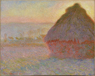
The three works I situated myself in front of for this were three of his particularly iconic works. He was well known for his series of paintings of Rowen Cathedral and of haystacks, painting the same subject under different lighting and weather conditions so that where each work was the same composition, each was also strikingly unique in it's colour and the emphasis on light in its changing qualities, accentuating the effects of the passage of time - time over the day and the year.

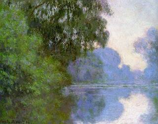
It is almost unfortunate that these series' have long ago been divided up, lessening their impact but even seeing just one of each of - Grainstack (Sunset) and Rouen Cathedral Façade and Tour d'Albane (Morning Effect) - still had significant impact. Another one I'd never seen before - Morning on Seine, near Giverny - I found particularly striking in the clever interplay of colour making it almost indistinguishable where reflection began. One could feel the serenity as if they were sitting right on the riverbank on a crisp morning.

Then - once I gathered enough strength - I would slowly walk towards the painting and watch as the landscape dissolved into a mess brush strokes and colours. Seemingly irrelevant colours and lines make it impossible to define where the edge between the mountain and the sky had been, somehow melding in the brushstrokes without the colours actually ever blending. Any section of any painting chosen at random would be abstracted out of context, bearing on reference to the original subject. Truly this shows that Monet had mastered techniques of colour and optical blending, where in the mind simply pieced the colours and shapes together from a distance, playing on contrasting colour for emphasis and to make certain aspects stand out. One section of the guidleline notes alongside the works stated that these techniques were outrageous at the time and it was suggested that viewers only be allowed to view the works from such a distance that the landscape is recognisable. It seems almost ironic in that the impressionists were painting as is, as they saw, what they saw, and yet this abstraction is created on another level of the work.

Yet when examining these brushstrokes in their colour and texture, truly he does manage to convey the landscape in a way beyond what we immediately see in front of us. The effects of light, movement and time are instead reflected.

The third way was to then slowly unfocus my eyes to try to fuse the colours and brushstrokes together again and where this didn't result in the perfect landscape again, it gave another view. It showed how the works were divided into blocks of colour. It gave a mixed sense of space, once giving a sense of space, once completely flat. Similar to the optical fusion technique, what was completely outrageous at the time is now a lot easier for us to experience and understand from being more used to deceptive tricks of light and space and optical illusions.

I firmly believe that art works are best encountered in person and my faith in this is reaffirmed after this exhibition. The ways in which I approached the works would only be possible in the same physical to truly embrace the sheer scale and the clever interplay of colour and brushstrokes to experience the full impact. I believe in saying this, the Monet and the impressionists successfully achieved their aims in conveying elements of a subject beyond the immediate physical nature which in respect to his, conveyed more about the physical nature of the space. I could actually feel the impression of the sunshine, the breeze, the storm, the air that the artists were trying to convey. It is no accident they are regarded as some of the greats in art.

Issues they explore are similar to that which I can understand in regards to my photography - how do you capture a sense of time and atmostphere, movement and life in mere fractions of a second?

I was told by others that it is a good exhibition if you cannot get to the big galleries overseas to see the larger collections. As I plan to get to these galleries one day, it is only to my benefit and joy that for now, I got to see this one.

"Colour is my day long obsession, my joy and my torment."
- Claude Monet
Water Lilies 1905


Thursday, April 23, 2009

Rose tinted glasses...splattered with paint

Where I always try look for the deeper meaning in any art I encounter, it was nice to finish off our gallery hop for the day with some more lighthearted and colourful works which I couldn't help but smile at the Two Rooms Gallery. Tracey Moffatt explores and idea which carries an almost universal empathy in her First Jobs Series (2008) - she revisits the mundane workplaces from her past in reinterpreted spirit of cheerful irony. It reminded me of the pop art style in that the everyday and the mundane was represented in a cheerful and garishly colourful style to draw attention to what is overlooked and perhaps raise it to a higher status by representing it as art.

Permeated with bright pastel colours, the scenes of a restaurant, a grocery store, a car lot, a hairdressers and the like are almost surreal. They aren't extremely abstracted and the colour is augmented in almost a subtle way at first glance. The object, the walls, the floor, the people look like they were always mean to be those particular colours but fit in seamlessly as part of the whole spectrum of the composition.

Take for example Corner Store 1977 where it seems perfectly normal for it to be displaying a range of brightly coloured candies and other various spectrums across the shelves while the bench, the menu, the counter and the wall are all seemingly normal colours. Yet when combined as a whole create an almost unnatural spectrum to be seen in one small space.

In search for the deeper meaning, her work explores themes of oppression, hysteria and forms of escape: "When I think of those early years I realize that I was learning to be tough and work whether I liked it or not. I put my head down and was forced to be productive". She depicts herself in these works, perhaps in a too bright shade of orange, like someone whose eaten too many carrots, and with a large smile. So perhaps by juxtaposing the mood in these scenes it is to say that even though she may not have enjoyed those jobs then, she retrospectively sees the merit in having done these jobs to get her through "those lacklustre, mundane jobs we were obliged to do as teenagers and art students in order to survive." One cannot approach these wonderfully large and cheerful works without a sense of humour and a smile as we naturally respond to the colour.

Image: Fruit Market 1975

Upon closer inspection, the artist's hand in the manipulation of these images becomes more evident: it seems as though the photographs were actually taken in or converted to greyscale and then coloured with the edges not perfectly filled - almost a childlike aspect to the work like the days of trying to 'colour in the lines', in keeping with the theme of nostalgia and reminiscing, perhaps serving as escapism from reality. It is not meant to be subtle and by revealing the artists hand in the work represents that idea of rose tinted glasses and trying to consciously maintain a positive outlook on what is perhaps a mundane or undesirbable situation.

I enjoyed these artworks and think it it something a lot of people can associate with, whether on an initial surface level by taking in the wonderfully cheerful and bizzarre colours and situations and in the idea that we are searching for that higher purpose in life, that dream job we aim towards and have to slog through the challenges in life to get to. Having worked in retail myself for almost four years, it is definitely an idea I can associate with. Like the pop artists who depicted the everyday and mundane to give it a higher status, perhaps she acknowleges these everyday and mundane jobs as integral parts to not just society, but in developing the life of an individual within society.

After studying and having seen abstract expressionism, I keep finding many references back to this style. Similar to the abstract expressionists, Murray Green "reference[s] the fundamentals of making a painting; both the brushstroke and the properties of paint." Where abstract expressionists such as Jackson Pollock achieved this by pouring and dripping thick and viscous paint onto a horizontal canvas, Green approaches it in a completely different way. He "encompasses the skills of chemist, craftsman and inventor" using "an array of unorthodox painting materials such as urethanes and polyester resins."

The works are seemingly simple in composition; often just a plain field of colour, sometimes divided horizontally into sections - not unlike the colour field painters. But where abstract expressionists aimed to emphasise the 2D nature of the picture plane, Green has built up his works in layers so a second and sometimes third colour sit shifting below the surface a different depths and sometimes secreting through the surface, so expertly suspended in time and motion that one must refrain from try to catch or wipe away the drips of oozing paint. Often his clever interplay of colours results in a tension which emphasizes the movement.

Image: Third Watch III 2008

Even where he uses similar or a single colour, the highly textured nature of it ensures this same level of dynamic movement and interplay. By leaving his works absent of any recognisable subject matter, it is open to interpretation based on how each individual approaches is and associates with the colours. What is interesting is that even though he sought the same sort of purpose as the abstract expressionists, to reveal the nature and properties of the paint, there is actually very little to reveal the process of painting. The drips and blobs seem accidental and secreted and moved in a disembodied state, rather than intentionally by the artist. More is revealed about the physicality of the paint rather than the moods, emotions and thoughts of the artist - the abstract expressionists often depicted both. I, like I saw others in the gallery likewise doing, found myself peering along the edges of the works to try visually deconstruct the process.

Image: Locale Knowledge #4 2007

I did however like this gallery to finish on a light note. The works were unique and dynamic and brought a smile to my face. Where so many artists try to redo what Pollock did, with his iconic drip works, Green approached the similar concept in a new and exciting way. Is that not a challenge in art?

Wednesday, April 22, 2009

Objects in Space

With objects suspended in the viewers space, Objectspace presented a more interactive way to view the pieces it had on display. Following on from our previous gallery, our journey seemed to continue along a similar theme of New Zealand culture with it's exhibition New Threads: Contemporary Male Weaving. It displayed objects in the traditional Maori weaving techniques in creating the grass skirts, cloaks, bags and poi. The twist was that where these have grown in more recent culture to be viewed as womens' crafts, these were done by men, aiming to "dispel long held misunderstandings about the role men have played in the history of weaving" and "examine some of the misconceptions that have developed around the significance of gender." Also interesting, were these pieces are rooted in traditional methods and materials of Maori weaving, not all of the makers of the pieces of Maori.

Having learnt briefly about traditional and contemporary Maori art, these object and customs hold a lot of cultural significance and often caused controversy when more modern artists began incorporating aspects of it in their art work, especially artists of different ethnicities. Maori artifacts used to be regarded more as crafts rather than art, perhaps also viewed more as 'womens'' crafts. When Maori imagery and symbols began to be assimilated with European art, it was argued that the symbolic and spiritual meaning was being exploited. European artist Gordon Walters in particular caused controversy when he took the Koru motif and represented it in a stylized manner in his artwork, focusing more on the formalist properties of it in creating patterns and "revitalising forms, methods and ideas" from primitive art. Issues around the appropriation of similar motifs are not uncommon when art crosses these cultural boundaries.

Image: Gordon Walters - Tamatea

Similarily, the focus of this exhibition on gender roles around these customs reminded me also of the works of feminist artists, predominant in the 70s who challenged what constituted as 'feminine crafts' rather than art, seeking to elevate it to match the more 'male dominated' forms of art. For example, New Zealand feminist artist Carole Shepheard often incorperates aspects methods such as quilting, referencing the process of assemblage, sifting, selecting, matching and contrasting to create the patchwork aesthetic. Such methods are common in feminist art to change perceptions assigned roles in society which I felt was also conveyed in this exhibition.The importance of gender roles also varies across different cultures and even in socieities where these aren't as predominant, it can still sometimes be difficult to overcome lingering traces in peoples' minds.

I think these ideas are very relevant in society today as the world becomes more globalised and many people are at bicultural, live in different countries to that which they were originally born in, and associate themselves with more than one culture. This often creates a tension when rather a sense of tradition is valued, whether around culture or gender roles. Associating with two cultures myself having been born in Hungary and being Hungarian by nationality yet also having lived in New Zealand since I was three, I feel it is important to be able to explore and express multiculturalism without fear of being accused of cultural insenitivity.

The featured work in the window display at this gallery in the was a site specific installation called Autopoios by Caroline Earley [link] exploring a "transdisciplinary study of the abstract organization of phenomena" and the idea of "a closed, dysfunctional system using vessels reminiscent of scientific glass forms and their appendages." The installation consisted of several multi coloured pieces which resembled perhaps pieces of bodily organs with protruding vessels and painting in a variety of bright colours arranged on the bottom and up the side of the platform upon which it was displayed.

In saying that it supposedly they serve no practical function, it was almost a challenge to come up with potential creative functions for it. Ryan suggested using them as a vase, sticking flowers into the open tubes which in fact would look very interesting especially if you chose equally colourful flowers. This goes to show that regardless what an artists' intention is with any artwork, it is all about how each individual person approaches it and what they bring to it. Like with any installation or sculpture, the 3D nature of it, especially in the peculiar nature of their shapes, cried out for the physicality of touch.

So again I will finish on the ideas I always seem to come back to. I prefer to encounter art in a context in which I can move around the physicality of a piece, finding it easier to interact with it and I feel Objectspace was successful in exhibiting these works in this way. At the end of the day, I think that it is the meaning and understanding you can take away from encountering art that is worthwhile, whether from past learning, curators notes, intuition or ultimately how you personally engage and respond to it that is is all about. Though I am not thoroughly familiar with the cultural significance of most Maori customs, I could relate the themes and ideas to my own understanding and past learning of cultures; even after reading the notes about Autopoios, I felt I engaged more with the meaning, thought and emotions triggered by the aesthetic qualities of the installation more than perhaps the 'intended' meaning.

Tuesday, April 21, 2009

Exploration of land and identity

New Zealand themes around landscape and identity are commonly explored by New Zealand artists and as artistic style develops and we form our own distinctive style around these themes, there's always the challenge of how to do this in new and different ways. The Satellite Gallery was exhibiting works by John McNicholas who explores distinctively New Zealand shapes , forms and colours in his depictions of landscapes through his painting, often from an aerial perspective. He aims to "[carve] out familiar coastlines with a new sense of mystery and imagination."

The earlier works are rendered in greyscale with a mixture of sections of flat colour and mottled textures within the same painting to create and mixed sense of perspective. At times the landscape is completely flattened while other sections of the painting create a sense of perspective, resulting in a shifting space. Some works contain among the grey some distinctive mountain shapes coloured in green. They seemed to symbolize New Zealand's 'Clean and Green' culture whilst juxtaposing it among the monotony of the grey industrial area to make a comment on this supposed environment.

The flattened out landscapes were reminiscent (though I'm not sure if this was intended but it was what sprung to mind for me) of traditional Maori tribal tattooing in its simplistic use of flat colour and shape to create pattern. I think this is a clever way to represent the land and it's people through a distinctive and unique aspect of the culture.

The next phase of his work goes into the use of colour and tonal variations, resulting in a shift away from the more abstract style into aerial perspective. I found these works to be of mixed success. Some colours were so fantastically vibrant, especially in the use of blues and greens for the sea and the sky that it drew you towards it from across the room. One such work consisted of three small square canvasses, each one progressively zooming in on Rangitoto Island. Though aesthetically pleasing, it is all too much like many previously done depiction of the landscapes of New Zealand. As he developed his coloured style, he goes back towards abstraction and mixed viewpoints in depicting the landscape. Overall, I found it a bit harder drawing the meaning and symbolism from these works and often I felt there was no real focal point or in the works making them less effective, such as the one below.


Overall, I felt this exhibition was interesting in that you could see the progression and development of the artist's style over time whilst focusing on the same subject with varying degrees of success. It perhaps also represents the shifting of our land over time and the changes in how we treat, value and relate to it. Like any geographical map, the landscape changes with time from both natural and man-made influences as well as technological advancements in terms of an accurate representation of reality. Yet, when represented through art, the land can become an outlet for expressing personal emotions linked the land and identity which when combined with all of the above, creates an endless possible scope in how the New Zealand landscape is depicted. This is without a doubt what we have seen and will continue to see.

Note: Documentation of this artist's work is difficult to obtain online, hence lack of images.

Friday, April 10, 2009

The depiction of 'reality'

In search of another gallery, Presentation / Representation at Bath Street Gallery drew me in with the concept behind it being and exhibition of works by 10 artists ranging from digital imaging to traditional 'authentic' methods to juxtapose "the artists’ individual ways of finding their image."

My interest in art began when I started photography but since since I actually started studying art history, I found I actually enjoy studying paintings more than photography. As a photographer, I often feel frustrated in the devaluing of photography as an art, often dismissed as 'just taking photos' as, unlike a painting, you often do not see all the time and trial and error which has gone into a work. With a painting you see all the meticulous brush strokes and get a sense of the amount of work which has gone into it. So despite the hipocrasy of it, I often all too easily write off photography exhibitions and am usually unimpressed. I did feel this was necessary point out now as I didn't feel particularly inspired by most of the works of this exhibition.

Regardless, I always attempt to look for meaning or aesthetic value or some indicator of the process and thought and hard work behind the image. The first series of works was by Laurenz Berges and I approached these in terms of aesthetic and compositional elements. The large scale photographs were often quite stark and gave an impression of looking out and enclosure. Stark, dilapidated indoor settings drew attention of texture and space with not much else in the frame. The colours were all dull and subdued and I felt the sense of confinement it conveyed pressing in on me. Though they weren't particularly cheerful works you'd want on your wall, they did convey some sense of meaning and emotion but they weren't particularly powerful or moving. Upon reading up on him, he is referred to as a "chronicler of absence" with meanings behind his works around the existential significance, trainsience and loss of space so to some extent these ideas came through to me.

The series I liked best within this exhibition was the works by Heidi Specker depicting a "multilayered portrait of a woman she met in Switzerland." When I first looked at these works I liked them for their focus on textures and elements in nature and in face, the series joined on in a narrative which each work subtly incorporating some element of the previous photograph. Though there was one work featuring a figure, I did not realize the series was focused on her. Again it was only through background reading that the whole series was to depict this woman and thinking about it, we do not see her face so the other photographs of the world around her are what are used to define her. In fact, another look at the selections of landscape depict them not in a wide angled expanse of space as we are used to seeing with landscape photography, but rather carefully selective and cropped. Though I needed the background reading to understand the intended meaning, I found rhythm and beauty in the composition and texture of the environment. Perhaps also the selection of these to represent this woman are in fact to make the same sort of statement about her.


One series of works by Wiebke Loeper was the only one I had any trouble engaging with and felt I had to do a lot more background reading to understand the content. I couldn't find any direct compositional link between the images and by themselves seemed quite vague, I was unable to read any deeper meaning than having taken a camera out into a specific context and docuenting it. Essentially, that was on the simplest level the idea, a photographic documentation of the impact of the changes wrought by the political processes in Wismar and maybe some initial background knowledge on the historical significance would've deepened my understanding and appreciation. But even as the images didn't link together very strongly, I couldn't find much of the aesthetic value in the photographs.


Overall, even though I wasn't particularly moved by this exhibition, it may in part also be because it was in two parts and I only saw the second part. I didn't see much of a visual cohesiveness between the artists, seeminly linked more only by background and chronological timeline. It was meant to reflect ideas around the shift between a presentation of the world and an artistically based representation of it as caused by the shift in photography as an analogue to digital medium. This sort of topic is in fact connotative of ideas around how accurately area we being depicted a representation of 'reality' so I can begin to see the link in that each artists has depicted some reality to them. Essentially though, I see that as a given in art where artists aim to show some sort of truth or meaning which to them constitues as a reality, whether through literal presentation or represenation of the essence. Reality though is transient as it is something we each see and interpret differently, and that is why I feel we have art.